Navigating Explorer
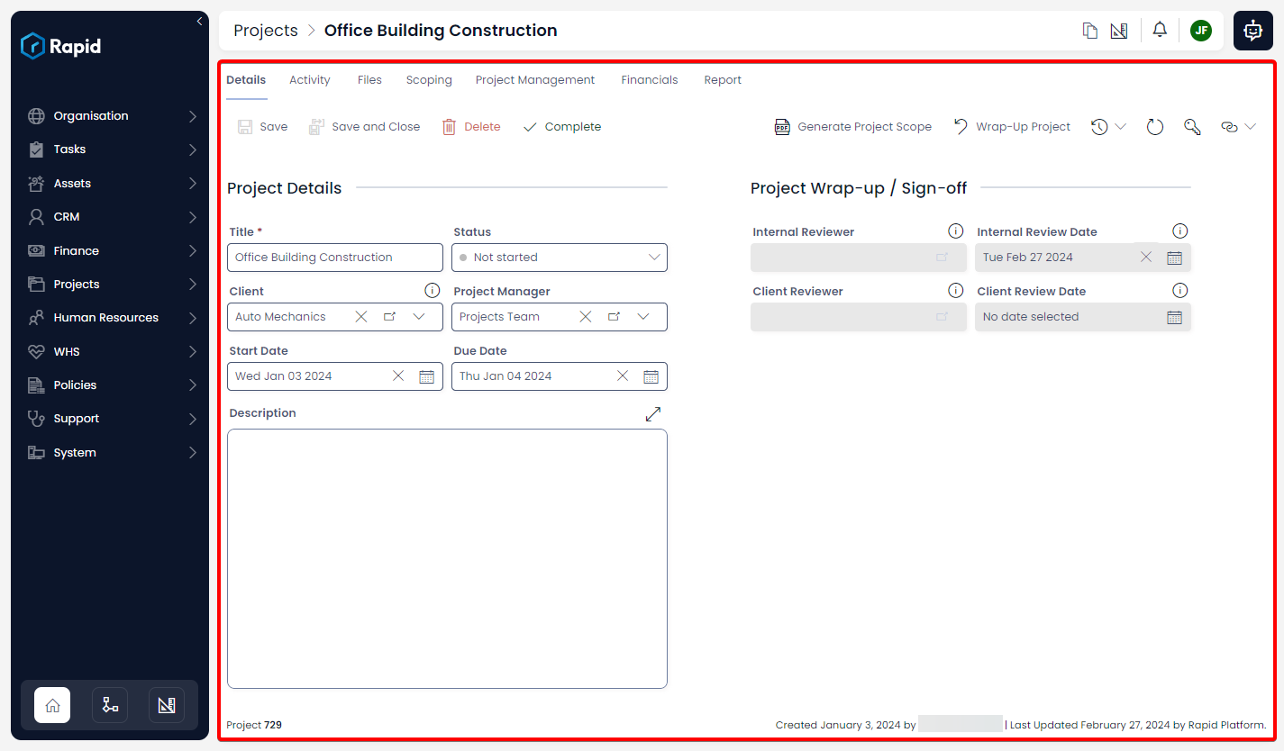
The main data manipulation tool that Rapid provides is the Explorer application. Explorer lets you view entities, modify, add and remove data. It is the primary front end experience that nearly all users interact with.
There are three main components which provide Explorer with its basic functionality: the Jumbotron, the Sidebar, and Pages. Each of these are explained below.
Jumbotron
The Jumbotron is found at the top of all pages within Explorer.
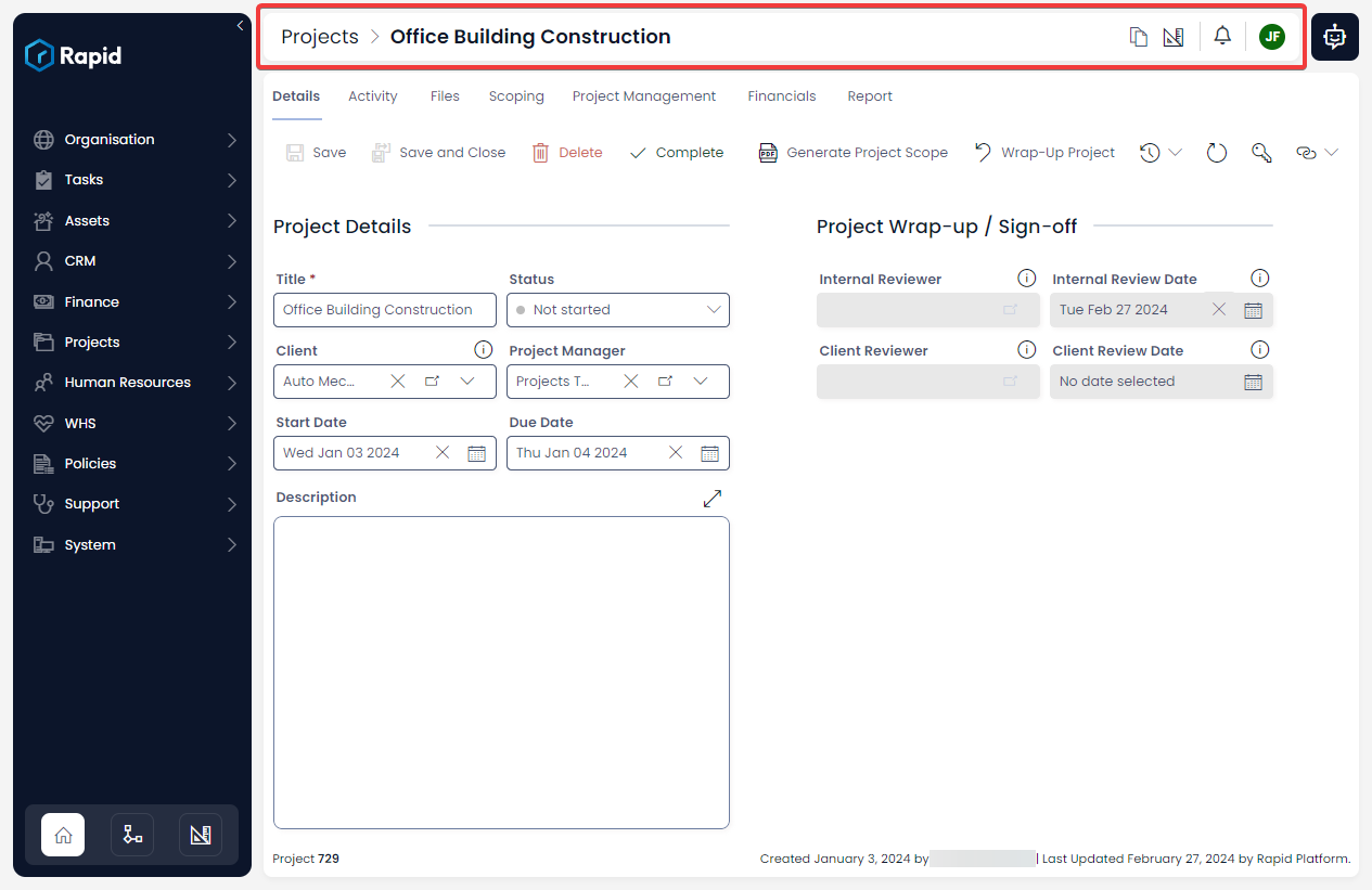
The Jumbotron contains several features, such as Breadcrumbs, Buttons, and the Rapido Chatbot. Each of these are explained in detail below.
Breadcrumbs
The Jumbotron displays the current Page's title, as well as a series of Breadcrumbs showing previous navigation steps. When viewing a Data Table, the Table's name will be presented in the breadcrumbs; in an item context, the item's title will be displayed.
The term "Breadcrumbs" comes from the fairytale Hansel and Gretel collected by the Brothers Grimm. In the story, the two children leave breadcrumbs behind them to find their way home. In web design, this term has come to mean a series of links that allow you to return to previous webpages that you have visited. Essentially, this type of component allows you to "retrace your steps".
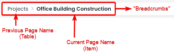
The current page will be rendered in the Breadcrumbs as bold text, and cannot be clicked. Previous pages, however, will be rendered as regular text, and can be clicked on.
Buttons
On the far right of the Jumbotron there are three buttons.

Each of the buttons and their functionality are explained below.
| Button Name | Description | Screenshot |
|---|---|---|
| Environment Switch | A button to quickly switch between the Explorer and Designer applications within the current item or list context. For example, if you are viewing the Employees table in Explorer and press this button, it will open the Employees table in Designer. Note that when you are in Designer, this button will change |  |
| Notifications | A button to access a quick popup window that presents the current users notifications. |  |
| User Token | A button to access information about the current user, including a log out button. |  |
Rapido Chatbot
To the right of the Jumbotron is a button to access the Rapid ai-powered Chatbot. For more information please see our docs on how to use the Chatbot.

Explorer Sidebar
The side bar is used for navigation, which can be found on the far left of any page inside Rapid Platform. This menu is fully customisable. Items in the sidebar can point to Rapid pages, external links, and can also open forms or applications.
By default, all Tables created in your Rapid site will be added to the Explorer sidebar.
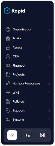
Experience Buttons
Explorer
At the base of the Sidebar are several buttons used for navigating to other applications. When you are using Explorer, you will note that the Explorer button, which has an icon of a house, is highlighted.

Workflow
You can navigate to Workflow using the centre button, which has an icon of a flow chart.

Designer
You can also navigate to Designer using the button on the right. This button's icon resembles a ruler and a set square.

Pages
The Page component is how all data is conveyed. A page can be set up in countless ways as there are a multitude of page components which can be added to a page. All entities that are present in the Explorer Sidebar can have pages added.
- You can also read an overview of how to use pages.